Background image
Jumpers
Red,
white &
black.

As longstanding as St Kilda Football Club itself are its famous colours of red, white and black.

The iconic colour scheme has been part of the club’s identity since its earliest of days, gracing close to every champion who has ever represented the Saints. It can be traced all the way back to the club’s inception in 1873, and even predates the fabled Crest by around 60 years.

While the tri-panel design has been intertwined with the Saints for many years, the classic look has gone through several iterations over the 150-year journey.

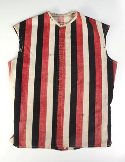
St Kilda's first guernsey was a far departure to today's look.

Debuted in 1873 during St Kilda’s days in the Victorian Football Association, this canvas, lace-up jerkin was often paired with a white neckerchief – and later a yoke – to distinguish it from other clubs.

Most notably, it is the only Saints guernsey to feature horizontal stripes instead of vertical ones, with matching, hooped red and black stripes mirroring the uniform’s top half.

While not a compulsory part of the official kit, many players opted to wear caps – some decorated in the club’s colours – and fasten belts to hold up their long (by today’s football standards) blue trousers.

1873 St Kilda Football Club
DRAG
The first iteration
St Kilda Football Club's 1889 Guersney
1877
The introduction on the white yoke on the guernsey fully replaced the neckerchief. Photographed in 1877, this St Kilda line-up was just the second Victorian team in history to travel interstate.
St Kilda Football Club's 2010 Pre-Season Guernsey
2010
An interesting take on the horizontal formation to say the least. The red and black hoops were replaced with large red, white and black bands, complete with an enlarged Crest at its centre. This pre-season guernsey was only worn during the 2010 NAB Cup.
St Kilda Football Club's 140 Anniversary Guernsey
2013
A modernised take on the inaugural look. Brought back for the club's 140th anniversary celebrations, the design foregoes the yoke and neckerchief in favour of white collar and sleeve cuffs. Additionally, the names of every player to register five or more senior games are printed within the stripes.
Horizontal stripes were soon replaced with familiar vertical ones.

A step closer towards the tri-panel design known and loved today, this guernsey adopted in 1886 is the first St Kilda guernsey to feature vertical bars, colloquially known as ‘candy stripes’.

As was the case with the club’s inaugural kit, blue shorts were made a part of the playing get-up. Despite the colour being linked to the club’s merger with Prahran Football Club, the actual reason for the odd choice was due to navy shorts being cheaper to produce than black ones!

These guernseys were still made out of canvas, with leather lacing tying it altogether.

St Kilda Football Club's
DRAG
Canvas & Candy stripes
St Kilda Football Club's 1888 Guernsey
1888
Before the classic woollen jumper, lace-up canvas guernseys were the fashion of choice. Worn by J.B. Stewart, this jerkin from 1888 is the oldest-known guernsey in existence.
St Kilda Football Club's Guernsey 2003-2005
2003-
2005
The 'Candy Stripes' have been revived throughout the club’s history, most notably as the away/clash kit of the mid-2000s. Initially, this only meant to be worn as a one-off guernsey for 2003 Heritage Round.
St Kilda Football Club's 2006 Guernsey
2006
In a slight tweak to the previous design, candy stripes carried up and down the length of thee guernsey, only interrupted by the white number panel. From 2003-2005, the stripes only filled the jumper's bottom half.
2024
Almost 20 years since it last featured on-field, the cherished candy stripe made its highly anticipated return as part of the Gather Round; a festival of footy featuring all teams playing matches across South Australia.
Entry to the VFL fuelled another new motif for St Kilda.

The breakaway from the VFA to form the VFL not only birthed the competition cherished nation-wide today, but the next evolution in St Kilda’s identity.

First worn in 1883 in the VFA, it remained the club’s primary kit until the outbreak of World War I. With the advancement in knitting and dying techniques, woollen guernseys took precedence and saw the canvas forerunners phased out. Blue shorts were also discarded by 1909 in place of black ones; now far cheaper to produce.

Melbourne’s wintry and oftentimes unkind weather could make these difficult to remove and particularly heavy when wet. Guernsey numbers were first introduced competition-wide in 1912, however they did appear – albeit far smaller – during the previous season’s finals series.

St Kilda Football Club's VFL guernsey
DRAG
Tricolours taking shape
St Kilda Football Club James Smith
1893-
1909
St Kilda officially registered for colours of red, white, black and navy blue ahead of the maiden VFL season in 1897. The colour lasted until 1909; the same year the red and black hooped socks were replaced by predominantly black pairs.
St Kilda Football Club's Dave McNamara
1906-
1909
Although wool was the far popular choice, canvas jerkins refused to die out immediately. Players like Dave McNamara would wear the lace-up alternative opposed to the burlier woollen guernsey, which remained an option until 1909.
St Kilda Football Club's Centenary Guernsey
1996
Debuted for the AFL's Centenary Round, this guernsey incorrectly depicts faux laces running through the centre of the jumper. The original guernsey on which this design is based never employed leather lacing, as wool had replaced canvas as the material of choice.
St Kilda Football Club's 2015-2016 Guernsey
2015-
2016
An all-white back as opposed to stripes serves as the main difference for this variant, which was worn across 2015 and 2016 as St Kilda's away kit. A new style of collar is the central distinction between these two years.
St Kilda Football Club's 2018 Reimagine Moorabbin Guernsey
2018
St Kilda’s landmark return to Moorabbin in 2018 sparked its own commemorative guernsey. Taking inspiration from the club’s inaugural VFL jumper, the Reimagine Moorabbin guernsey recognises those who made significant contributions to the redevelopment of RSEA Park, with their names printed within each panel.
A few years into life in the VFL, another colour was thrown in the mix.

Red, white and black has been synonymous with St Kilda from its earliest days, however that hasn’t always been the case.

The Saints briefly abandoned the white in favour of yellow during World War I to distance themselves from the colours of the German Empire. St Kilda’s new colours doubled as a showing of support for Allied force, Belgium, which had several Saints serving in the country.

St Kilda discarded its stripes entirely by 1919 in place of a yellow chevron – and added band in later years – before reverting to their traditional colour scheme by 1923. While the yellow scheme didn’t go the distance, the introduction of collars did, which endured consistently from 1919-1984.

St Kilda Football Club - Yellow Stripe Guernsey
DRAG
Red, yellow & black
St Kilda Football Club's 1914 Guernsey
1914
At the outbreak of the Great War, St Kilda adopted a red Australian flag on its regular jumper for the final two rounds of 1914. Although hard to see, this image was taken during Round 17, 1914 against Geelong.
St Kilda Football Club's 1915, 1918 Guernsey
1915,
1918
It was a straight swap of white for yellow as World War I raged across the Pacific. St Kilda went into recession from 1916-1917, but readopted the scheme from 1915 upon reformation.
St Kilda Football Club's 1919-1922 Guernsey
1919-
1922
During this time, different variations of the uniform bled into each season. The chevron was initially narrow and extended well down the torso, before becoming fatter throughout 1920 and remaining contained to the torso's upper section. The accompanying band was eventually incorporated by 1921.
Fraser Gehrig During Heritage Round
2005
Over 90 years after it was last seen on-field, St Kilda reintroduced the red, yellow and black stripes for the 2005 Heritage Round. While the club's divisive 'Pura' guernsey brought back the yellow first, there's more on that later...
St Kilda Football Club's 2019 China Guernsey
2019
Yellow was back on the menu - albeit far more sparingly - for the club's one and only bout in Shanghai, with one cuff's colour changed to match those of the Chinese flag.
2023
In commemoration of its Ganbu marnang n’uther boolong – the Boon Wurrung translation of '150th year' – and those who have contributed to its yawa, St Kilda Football Club brought the yellow back for its 2023 Indigenous Guernsey. The family totems of St Kilda's seven Indigenous players are accompanied by traditional gathering place and journey path symbols to further reference the club’s yawa.
2024
Yellow again returned for the following year's Sir Doug Nicholls Round, with this striking design accompanying the club's landmark name change to 'Euro-Yroke' in celebration of Indigenous culture and its continued yawa. A white clash variation was also designed by Wagiman artist Nathan Patterson; a first for the Saints.
At last, something a little more recognisable.

The famed tri-panels of red, white and black were first introduced in 1923 and have remained virtually unchanged over a century on.

While the motif has remained largely consistent over that time, the striped sleeves only lasted one season before being replaced by an all-black scheme with red cuffs for the next nine years.

It’s a classic appearance intrinsically linked to St Kilda, but there is something missing. It may seem to be a minor absence, but its importance and significance to the Saints’ identity can’t be understated.

The Crest was the finishing touch.

While a small addition in the overall design, the magnitude and importance of the Saints’ Crest can’t be understated. So integral to the club’s very identity, it has appeared on every single St Kilda guernsey since 1933.

The origins of the Crest itself remain hazy, but quickly became engrained in club folklore after an undermanned and injury-ravaged St Kilda triumphed over against North Melbourne against all odds in a bloody match at Junction Oval (pictured).

Medals adorned with the Crest – which was present on the guernsey at the onset of the season – were struck to commemorate the day, serving as a reminder never to give in, even in the most dire of circumstance.

DRAG
Front & Centre
St Kilda Football Club's Crest Guernsey 2007-2008
2007-
2008
While the Crest has been present on every iteration of a St Kilda guernsey since 1933, some have been more prominent than others. This oversized guernsey was first designed as a clash kit for matches with Collingwood, before becoming the away strip for 2008.
St Kilda Football Club's Crest Guernsey 2011-2012
2011-
2012
Although shrunk down, the large-scale Crest was just as prevalent for these NAB Cup pre-season kits. The white version was worn across both 2011 and 2012, while the black variant was exclusive to 2011.
St Kilda Football Club's Stickman Guernsey 2014
2014
Although less popular and long-lived (and official) than the Crest, the iconic 'Stickman' has long been linked to St Kilda's identity. In 2014, the Stickman worked itself onto the club's pre-season guernsey in 2014, but had never returned on playing apparel until....
2024
A decade since it was last worn, a revised Stickman guernsey was brought back for the 2024 AAMI Community Series. One of the Saints' most adventurous kits, the split-kit has nonetheless become a quirky favourite of the faithful.
Red, white and black: A timeless classic.

St Kilda’s guernsey underwent little cosmetic change from 1933 onward, with the introduction of an all-black back – brought in twice from 1945-1952 and again in 1957 by Alan Killigrew to make the side look more fearsome – the only major difference compared to its predecessor.

It was a change that has since carried into today’s day and age, with the red, white and black panels previously mirrored on the back of the guernsey, save for a black bounding box to house playing numbers (except for in 1933). The three-colour hooped socks, also originating in 1957, have similarly endured.

The popularity of the sleeveless option all but phased out the age-old long sleeve by the late 1950s, however players such as Bill Young kept the traditional look alive.

Red, white and black: A timeless classic.
DRAG
A few little tweaks
Darrel Baldock Hall of Fame Inductee 2003 and Inaugural Legend
1960-
1972
Pin-striping along the length of the red and black panels was the first amendment to the longstanding motif, which were present on the club's Premiership guernsey of 1966.
St Kilda Football Club's 1999-2009 Guernsey
1999-
2009
While colours and cuffs have flipped between black and white for years on end, the 2000s introduced piping along both areas to give its own unique look. While disappearing for some years, the piping was resuscitated in commemoration of the club's 150th year.
St Kilda Football Club's 2009-2010 Guernsey
2009-
2010
The Saints' middle panel was given a whole lot more real estate as part of the club's away kit from 2009-2010. Most notably, this jumper was worn during the 2010 Grand Final and was just one favourable bounce away from being the guernsey of Premiers.
St Kilda Football Club's Round 22, 2012 Guernsey
2012
A very left-field take on the classic red, white and black. Worn only once in Round 22, 2012, this guernsey features the names of long-time members which combine to form the red and black panels.
St Kilda Football Club's 2020-2021 Guernsey
2020-
2021
Taking inspiration from the guernseys of the 1930s, St Kilda wound back the clock for its away guernsey. Rather than on a black base, the revised jumper was built on a white backdrop and only features the stripes on the back's lower half.
St Kilda Football Club's 2023 Home Guernsey
2023
Incorporating multiple elements from various St Kilda eras, the 150th Anniversary Home guernsey creates a new, but traditional look for 2023. Most prominently, the club’s commemorative Crest has been placed in a black patch with rounded edges, harkening back to the fan-favourite look adopted by the Saints from 1986-1996.
Then, the most revered guernsey of them all.

Barry Breen’s wobbly point which gifted St Kilda its maiden Grand Final triumph in 1966 was done so in this guernsey, however what should be the most iconic picture in club history of captain Darrel Baldock holding the Premiership Cup aloft had the red, white and black conspicuously missing.

As was tradition then, players swapped their guernseys post-match, resulting in the Saints’ greatest ever moment captured in Collingwood colours. Baldock was reluctant to do the guernsey trade at the final siren, but despite the pleas from his teammates for the sake of posterity, he felt it was the right thing to do.

A photograph of Baldock, edited to have him in his rightful colours, now sits proudly at the club’s home of RSEA Park, Moorabbin.

1966 premiership cup
The traditional look steadily evolved into the modern appearance.

While the long sleeve guernsey had faded in time after the late 1950s, it took until 1985 for the classic collar to be completely phased out.

Button-up variants were replaced by the open-necked (often hairy-chested) visage of the 1970s, before the V-neck guernsey became the look across the league. By 1982, sponsors were also present on the front of the guernsey, since expanding to the back and neckline in modern times.

Woollen jumpers were similarly substituted out for acrylic material leading into the 1980s, with polyester fabric and sublimated dying techniques following not long later to create the modern guernseys worn today.

Tony 'Plugger' Lockett
DRAG
The collar's comeback
St Kilda Football Club's 2006 Heritage Round Guernsey
2006
Fear not, traditionalists! The collar didn’t completely die off in 1985, being welcomed back for the 2006 Heritage Round, complete with a wider middle panel.  
2023
Back for a momentous occasion. The collar, along with black cuffs and pinstriping along the red and black panels, returned for the club's 150th Year Heritage Guernsey; a design taking inspiration from the threads of the 1966 Premiership side.
Never has a guernsey garnered so much popularity than the Crusader.

First worn as a one-off pre-season jumper in 1996, the aptly dubbed ‘Hot Cross Bun’ kit was so well-loved that it became the Saints’ home guernsey from 1997-2001, relegating the longstanding tri-panel motif to away games only.

Pinstriping on the collar and cuffs were also present on the guernsey from 1999 onward and were brought back again for 2023.

The Crusader kit has made several appearances throughout the years, including a commemorative edition for Nick Riewoldt’s 300th game (2016), a white-backed version (2017-2019) for away games and most recently, returning as the away guernsey in celebration of St Kilda’s 150th year.

St Kilda Football Club's Crusader Guernsey
DRAG
Crusader Revivals
Nick Riewoldt's 300th Game
2016
In honour of a champion, this guernsey was donned by the red, white and black in celebration of Nick Riewoldt's 300th game.
St Kilda Football Club's 2017-2019 Away Guernsey
2017-
2019
A white-backed version for away games, this modified Crusader removed the lower red panelling to create a striking look unique to its time.
St Kilda Football Club's 2022 Away Guernsey
2022
Seeing red! The Crusader was reinstated as the club's away guernsey for 2022, although this time with an all-red back to separate itself from its predecessors.
2023
The Crusader returned as the away guernsey in celebration of St Kilda’s 150th year, complete with a split red-and-black back and piping on the collar and cuffs to mirror the classic look.
Then, there was this.
The infamous yellow 'Pura' kit.

Fashion was questionable in the early 2000s, and some may argue this guernsey captures that sentiment perfectly.

Yellow was back in the Saints’ colour palette for this unique away kit, conceptualised as part of the club’s partnership with Pura Milk from 2001-2003. Red trim was added around the Crest iconography for the final year for an added bit of eye-popping flair.

Despite only being worn for five games during those three seasons, the memory of the yellow guernsey has endured. In simple terms, you either love it or hate it.

The infamous yellow 'Pura' kit.
History was made when the Saints travelled to New Zealand.

A trip across the ditch in commemoration of Anzac Day birthed several new St Kilda guernseys, which were worn in respect for those who served both Australia and New Zealand during the two World Wars.

Māori artwork is present on the 2013 and 2014 iterations of the design, with a red poppy in honour of the fallen appearing on both the 2014 and 2015 variants. The traditional red, white and black colour scheme of the Māori additionally align with those of the club.

It isn’t the first time the two nations have shared a footballing bond, with St Kilda playing a visiting Māori team all the way back in 1889.

St Kilda Football Club's Anzac Day Guernseys
DRAG
NZ Threads for Anzac Day
St Kilda Football Club's 2013 Anzac Day Guernsey
2013
Acknowledging New Zealand’s heritage with Māori art patterns, this guernsey reflects Australia and New Zealand's shared history over many years. Above the players’ numbers on the back are depictions of a stingray and a hammerhead shark, as well as the unique shape of the Sherrin.
St Kilda Football Club's 2014 Anzac Day Guernsey
2014
Using the traditional Māori art colours of red, white and black, the follow-up from the inaugural New Zealand guernsey explores the Anzac legacy via the use of the waka taua (ceremonial war canoe) and other Māori motifs, emphasising the shared waters between the two nations.
Carlton Football Club's Michal Jamison & St Kilda Football Club's Sean Dempster NZ ANZAC Day Game
2015
Incorporating Anzac symbols of the rising sun and poppy, this iteration of the guernsey acknowledges 100 years since the landing at Gallipoli and honours those who paid the ultimate sacrifice for our freedom.
Indigenous Round took the meaning of guernseys to another level.

The introduction of Indigenous Round, later named Sir Doug Nicholls Round, has seen arguably some of the most meaningful and eye-catching guernseys to ever grace the field.

All clubs across the competition have proudly worn a specialised guernsey from 2014 onwards in commemoration of Indigenous culture, often designed by past and present players of Indigenous heritage.

From the intricate linework of the Yorta Yorta mob, to the splatter techniques of the Noongar, every inclusion carries great significance, as does the honour players have when wearing them.

DRAG
Powerful Statements
St Kilda Football Club's 2013 Indigenous Guernsey
2014
Designed by Aunty Carolyn Briggs & Marcus Lee, Boon Wurrung.
St Kilda Football Club's 2015 Indigenous Guernsey
2015
Designed by Marcus Lee, Boon Wurrung.
St Kilda Football Club's 2016 Indigenous Guernsey
2016
Designed by Marcus Lee, Boon Wurrung.
St Kilda Football Club's 2017 Indigenous Guernsey
2017
Designed by Jade and Michelle Gresham, Yorta Yorta.